
From saavy market researchers to teams that hardly ever dig through data, all parties can appreciate results presented in a well-designed and thoughtful manner. That’s because digging through massive amounts of information can be a daunting task for anyone. This is where dashboards come in.
Well executed dashboards can help you more efficiently and effectively leverage survey or customer data for analytics and decision-making. When built with the end user in mind, they make it easier to highlight important information, support faster decision-making, and ultimately increase the value of your research.
In this article, we’ll explore key design elements for building dashboards that are informative and engaging. Additionally, we’ll share how the Profiles team at Kantar utilises dashboards to turn complex survey data into powerful communication tools.
Graphical presentation of data as communication
What happens when you see something that is visually appealing? It might be a bold pop of colour, a larger or heavier font, or another element that stands out from the rest.
Let’s look at two versions of a line chart. If you were asked to review the chart below, would you be able to determine what it is trying to communicate?
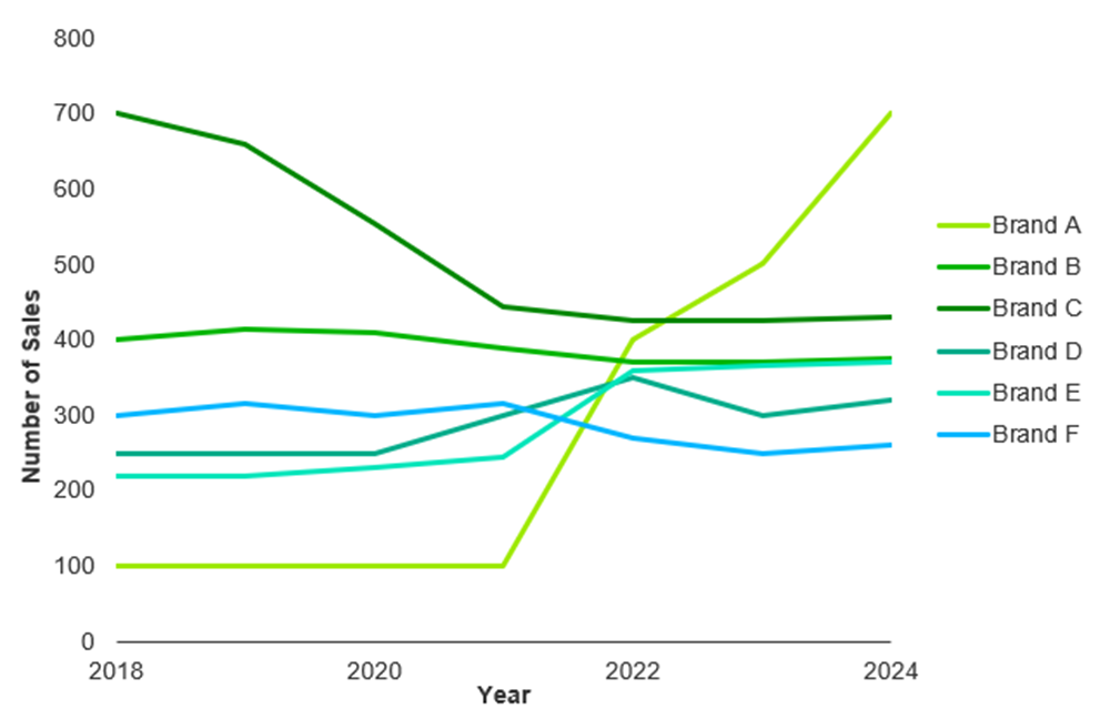
Now, let’s look at the chart again with some changes:
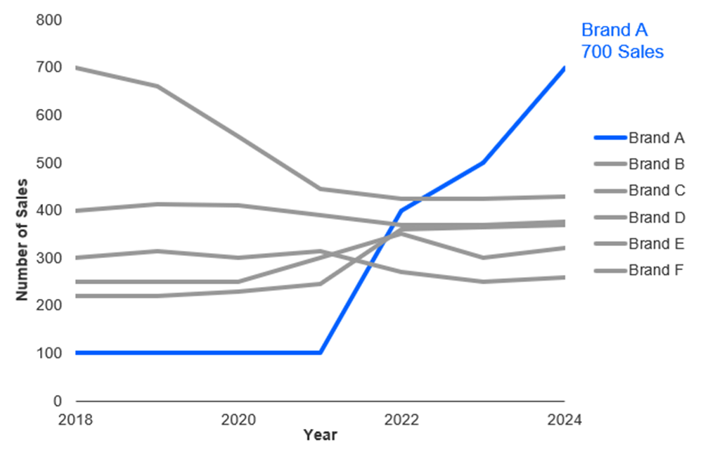
In the second chart, you can see that brand A has seen an increase in the number of sales since 2021 and is now at 700.
In this case, some additional text and colour influenced how quickly you were able to process the information and determine what the chart was trying to communicate. That’s because humans are hard-wired to process information that stands out.
Below are key reasons why the graphical presentation of data is beneficial:
- Facilitates ease of understanding of results and promotes comprehension
- Provides succinct portrayal of large quantities of information
- Provides the ability to highlight key findings while suppressing details
- Provides the ability to demonstrate relationships contained in data
- Improves decision-making
- Improves engagement and alleviates the boredom of reviewing repetitive data tables
As a creator of a dashboard, you can influence information processing using design elements such as colour, text, charting, whitespace, and more to help end users get the information they need as quickly as possible.
Guidelines for creating effective dashboards
Whatever dashboard you decide to build, you should consider these important design guidelines that will impact how end users perceive the data:
Clarify your target audience and their objective
Before you can do anything with dashboards, you need to understand who your intended audience is and what they want to achieve.
It’s essential to start with a conversation that uncovers: Who are you building for? What are they trying to understand or achieve? What do you need to show in the dashboard to help them understand this?
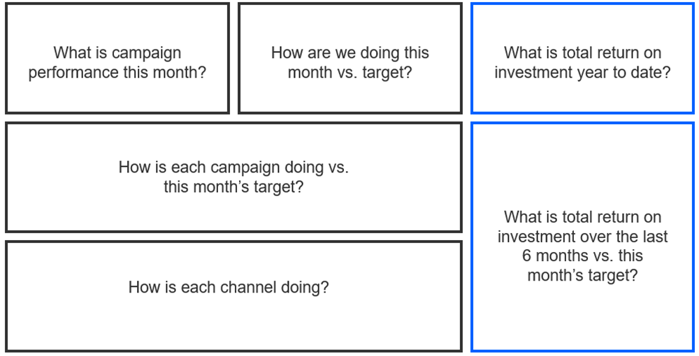
Let’s look at an example of what this may look like in practice.
A brand manager requests a monthly dashboard to track brand awareness. Through a thoughtful discussion, it becomes clear that the dashboard isn’t just for them, but for multiple marketing managers overseeing different campaigns. Identifying the specific audience helps tailor dashboard content and functionality to their needs.
Next, the conversation shifts to the purpose of the dashboard. The brand manager wants visibility into campaign performance against key brand objectives and insight into how likely they are to achieve monthly goals. When asked about common reasons for exceeding or missing goals, they cite factors like market trends, competitor activities, and customer feedback. These details aid in refining the dashboard’s goals: not only to campaign performance, but to surface underlying reasons for performance shifts.
From the discussion, you can determine which questions the dashboard should answer: Has the brand met its objectives over the last several months? How are different campaigns performing? Are competitor activities impacting results? How is each campaign contributing to meet overarching brand goals?
Be overt about dashboard goals in the title and subtitle
Once you’ve defined your audience and goals, the next step is to formalise them directly within the dashboard. This means creating a purposeful title such as “Campaign Performance Dashboard” that reflects who the dashboard is for. A clearly stated title and subtitle guide users and reinforces good design principles — that users should be able to immediately understand what they’re looking at and what to expect.
By anchoring your dashboard in a clearly defined goal, you maintain focus, improve usability, and deliver insights that stay aligned with your audience’s needs.
Guide users through data with smart layouts
The next important guideline for crafting effective dashboards focused on guiding your audience through the dashboard in a way that feels natural and intuitive. Since people tend to read from left to right and top to bottom, you can use this pattern to structure your data in a logical flow that helps users answer key questions in steps.
One strategy is to plan by sketching wireframes in advance. Mapping out where each piece of information will go allows you to organise data in a meaningful way. For example, you might place current performance metrics on the left side and historical trends on the right, creating a progression from immediate results to broader context.
Leading with high-level insights and then getting into more granular details also mimics how users typically absorb information.
The end goal is to design with intention, guiding users through your data visually. And planning your layout before building ensures the final dashboard answers the right questions in an ideal order, improving the overall impact.
Make dashboards accessible
When designing dashboards, accessibility means ensuring that users of all experience levels can easily interpret and engage with the data.
Never assume your audience has all the background knowledge. Your dashboard should be able to communicate clearly to a wider audience —from technical to non-technical, those working within different departments, or those unfamiliar with all the specifics.
To enhance understanding and reduce misinterpretation, don’t be afraid to include notes where they are needed. These can appear directly on charts, in the footers, or within tooltips (depending on the program or platform you are leveraging). Notes help users grasp details like how metrics are defined, where the data was sourced from, how or when it was collected, etc., making your dashboards more user-friendly.
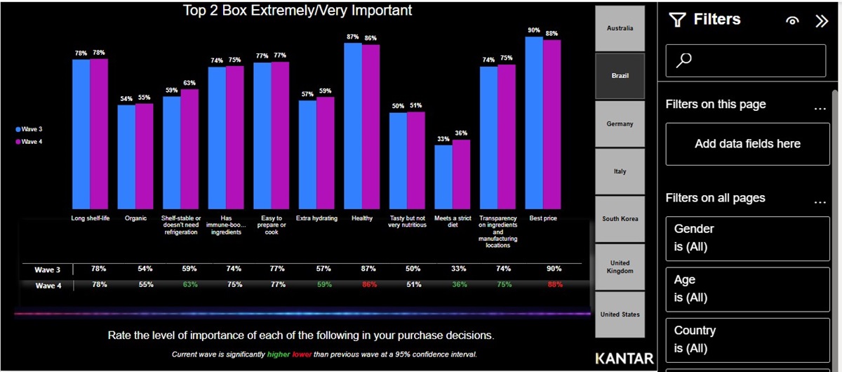
Interactivity also plays a role in accessibility. Adding filters, dropdowns, or slicers allows end users to tailor the data to their specific needs. Whether it’s exploring specific segments, categories, or dates, interactive elements help users dig deeper into the data and answer questions with ease.
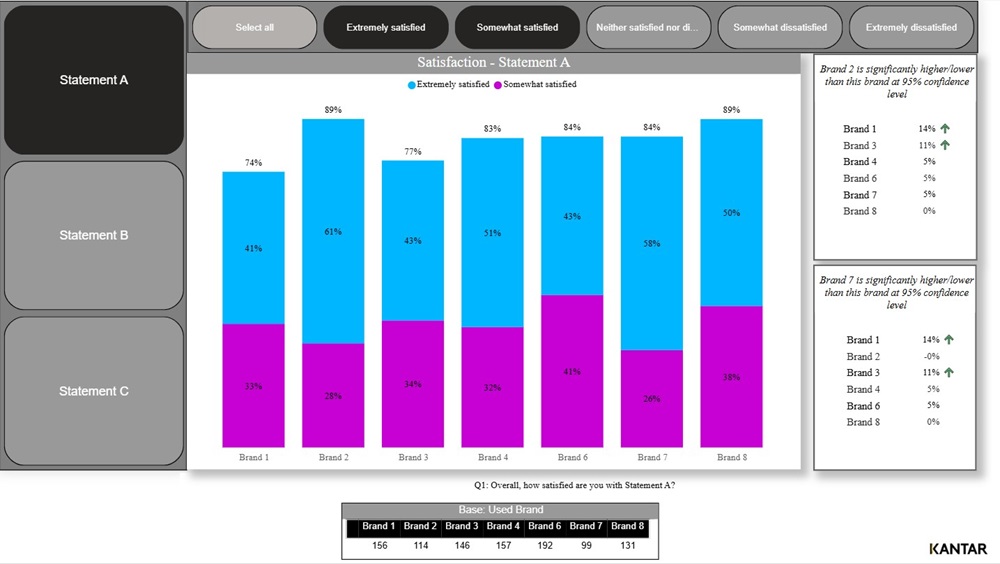
Below is an example of a dashboard that incorporates various filters and interactive elements:
Lastly, avoid assuming familiarity with internal jargon. You should spell out any acronyms for users who aren’t familiar with the specific terminology. The end goal is to minimise friction and make the data accessible for everyone.
Make dashboards beautiful
Charts, colours, and spacing all play a critical role in dashboard design by helping direct attention and communicate important information. These elements can significantly influence how clearly your data is understood and how quickly users can draw insights.
Selecting the right chart alone takes careful consideration. For example, a line chart might be ideal when you have a continuous data set or want to show trends, while a bar chart is often better suited for showing comparisons across various categories. To help guide these decisions, resources like this one offer a comprehensive library of chart types, complete with use cases and recommendations for when to use each type.
Additionally, your dashboard colour choices should be intentional to help enhance clarity. Avoid relying on the default color settings available in dashboard tools or platforms. Instead, consider using your company’s brand colours. But be cautious; if your brand palette is too limited or ineffective, you can collaborate with your design team to find the most visually compelling and accessible colour schemes.
The use of whitespace (the empty areas around the elements in your dashboard) can also aid in keeping information clear and focused. Avoid trying to use too many visuals that can overwhelm users and dilute your most important data.
Simpler dashboards with fewer, well-selected charts are often more effective. If additional information is needed, you can always consider adding new pages or a separate dashboard.
Case study
The Profiles team at Kantar offers custom dashboards to present data interactively and visually, making it easier for users to analyse key metrics.
Let’s look at how a global grocery brand was able to compare their top competitors among different demographic groups:
The challenge
The company sought to understand how their brands compared to top competitors across key demographics segments. Specifically, they aimed to gauge awareness, perceptions, and adoptions barriers related to new checkout technologies (both in-store and online). Their focus was on identifying what customers value most in a checkout experience: speed, ease, accuracy, and friendliness. In addition, the client wanted to explore what drives customers to feel appreciated during checkout and how that feeling ties to long-term brand loyalty.
The approach
To address these objectives, the Profiles team developed a visually engaging, interactive dashboard with robust filtering capabilities to enable self-serve analysis. The dashboard featured intuitive visuals including bar and column charts for brand comparisons, donut charts to show gender splits, and a U.S. map for regional analysis. Stats testing tables also highlighted meaningful differences between the company’s brands and competitors, as well as between generational segments (Gen Z or Millennials vs. other segments).
Additionally, users could slice the data by various demographics, sample groups, and rating scales. This allowed stakeholders to isolate insights on specific attributes or statements, tailored to the groups that mattered most to them.
The impact
The dashboard enabled the company to quickly visualise brand performance across segments, easily filter by demographics, and uncover insights without needing to dig through raw data. As a result, strategic decision making became more streamlined. The ease of use empowered internal teams to explore the data independently, leading to faster decision-making.
Conclusion
By applying thoughtful design principles such as clarifying dashboard objectives, making it clear how dashboards should be used, incorporating accessibility features and strong aesthetics, you can transform raw data into a powerful communication tool.
Interested in learning more?
Whether you want to enhance existing survey results or build something entirely new, the Profiles team at Kantar can help advise you on dashboard design best practices and build insight rich tools that your stakeholders will actually use. Contact us to learn more or request a demo today.